Have you ever opened an email and immediately felt like it was meant just for you? Odds are, you paid more attention—and maybe even took action. That’s the power of a personalized email. Today, your subscribers expect more than generic content; they’re looking for relevant messages that address their unique needs and interests.
Personalized email marketing uses subscriber data to tailor messages specifically for each recipient. As a result, campaigns see higher open rates, click-throughs, and, most importantly, engagement. If you’re wondering how to create a personalized email that actually resonates, you’re in the right place.
What Is Personalized Email Marketing?
Personalized email marketing refers to crafting email messages that feel one-to-one, instead of one-size-fits-all. It goes beyond using a subscriber’s first name. True personalization means delivering content, offers, and experiences that reflect each recipient’s behavior, preferences, and past interactions.
For example, imagine receiving a “Welcome, Jane!” email with product recommendations based on your last website visit, or exclusive tips tailored to your business niche. That’s a personalized email at its best.
Why Personalization Matters (with Real Results)
Personalizing emails has a big impact. Emails with personalized subject lines generate up to 50% higher open rates than non-personalized ones. The right approach builds trust and loyalty, since subscribers know you’re paying attention to their interests—making it more likely they’ll read, click, and convert.
Personalized email marketing is not only more effective; it’s quickly becoming expected. Segmentation and tailored messaging can increase sales by showing subscribers what matters most to them.
How to Create a Personalized Email That Gets Results
Ready to move beyond “Hi [Name]” tags? Here’s how to create a personalized email from start to finish:
1. Collect the Right Data
Start by gathering basic information like names and email addresses, but don’t stop there. Ask subscribers about their preferences, interests, or goals when they sign up or via surveys. You can also track website activity, purchase history, or email engagement. For example, use tags or custom fields in your email platform to tailor future campaigns.
2. Segment Your List
Segmentation is grouping subscribers by common traits—like demographics, behavior, or purchase history. According to AWeber’s segmentation guide, campaigns sent to segmented audiences can see up to a 760% increase in revenue. Segments could include:
New subscribers vs. long-time readers
Shoppers interested in specific products
Subscribers from particular geographic locations
Smaller, more specific segments allow you to write messages that truly resonate.
3. Use Dynamic Content
Dynamic content swaps in different images, offers, or copy based on the recipient’s data. If you have a sale for dog products, send a personalized email with dog toys to dog owners and cat treats to cat owners—all in one campaign. Most platforms, like AWeber, make this easy using conditional content blocks.
4. Personalize Beyond the Name
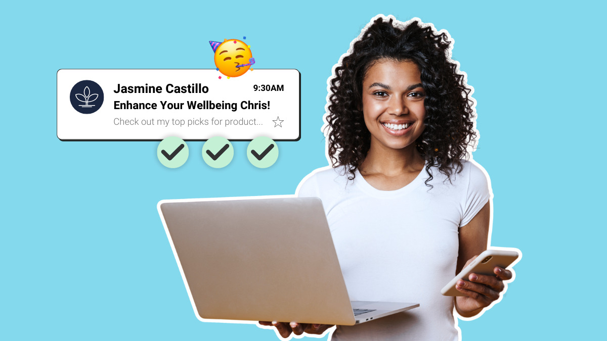
While addressing someone by name still matters, personalization goes further. Try referencing recent activity (“Loved your feedback on our latest webinar!”), suggesting specific products, or offering tailored resources. Add personal touches—like a recommendation chosen “just for you” or exclusive content based on their interests.
5. Test and Refine
Personalized email marketing isn’t one-and-done. Test different subject lines, sender names, and content variations to see what your audience prefers. Review performance metrics (like open rates, click-throughs, and conversions) and refine your strategy for greater impact. AWeber’s A/B testing guide offers in-depth tips.
Personalized Email Examples to Inspire You
Want to see it in action? Here are some effective personalized email examples you can model:
Abandoned Cart Reminder: “Hey Sarah, still thinking it over? The running shoes you viewed are waiting for you.” By including the product and a recipient’s name, this feels timely and individualized.
Birthday Offer: “Happy Birthday, Alex! Here’s 20% off your next order—just for you.” Birthday emails drive high engagement and show you care.
Onboarding Sequence: “Welcome, Mike! Based on your interest in marketing tips, here are three resources to get you started.” This targets new users and their stated preferences.
Location-Specific Events: “Hi Jamie, join us for our Boston workshop this Friday.” Geo-personalization ensures relevance and higher attendance.
Notice how each example goes beyond just the name—these personalized emails incorporate behaviors, preferences, and unique opportunities.
Pro Tips for Writing Impactful Personalized Emails
Personalizing emails effectively means more than dropping in a first name. Here are strategies that work for businesses of all sizes:
Be conversational: Write as if addressing one person, not a crowd. Use “you” and refer to specific actions or interests.
Offer value: Focus on how your product or content solves a reader’s problem. Present recommendations and tips based on their past actions.
Keep it ethical: Use data responsibly and let subscribers know how you’ll use their information. Provide clear preferences or opt-out controls.
Automate thoughtfully: Set up email automations for key triggers such as onboarding, re-engagement, or special occasions. But always test to ensure your messaging feels authentic and timely.
Common Personalization Pitfalls (and How to Avoid Them)
Even with the best intentions, personalized emails can go wrong. Avoid these pitfalls:
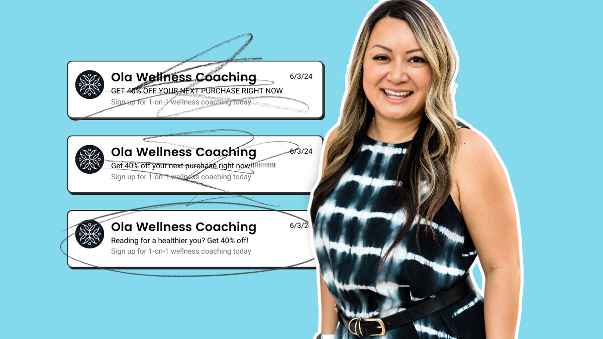
Overpersonalizing: Don’t use too much subscriber data in one message—it can feel invasive. Stick to what’s relevant and expected.
Outdated or incorrect data: Double-check your data sources. There’s nothing worse than addressing someone by the wrong name—or sending dog food deals to cat folks.
Neglecting testing: Always preview and test personalized emails before sending them to an entire segment.
Ready to Start Sending Personalized Emails?
Personalized email marketing isn’t just a trend—it’s how you build real relationships with your audience. By collecting relevant data, segmenting your list, using dynamic content, and continually testing, you can create memorable, valuable messages your subscribers actually want to read.
Next step: Review your current list and campaigns. Try segmenting your subscribers or customizing your next send with dynamic content. You’ll see firsthand how much more effective a personalized email can be.
The post Personalized Email Marketing: How to Send Messages Your Subscribers Crave appeared first on AWeber.